Category:
Web Design
Client:
Raffles Energies
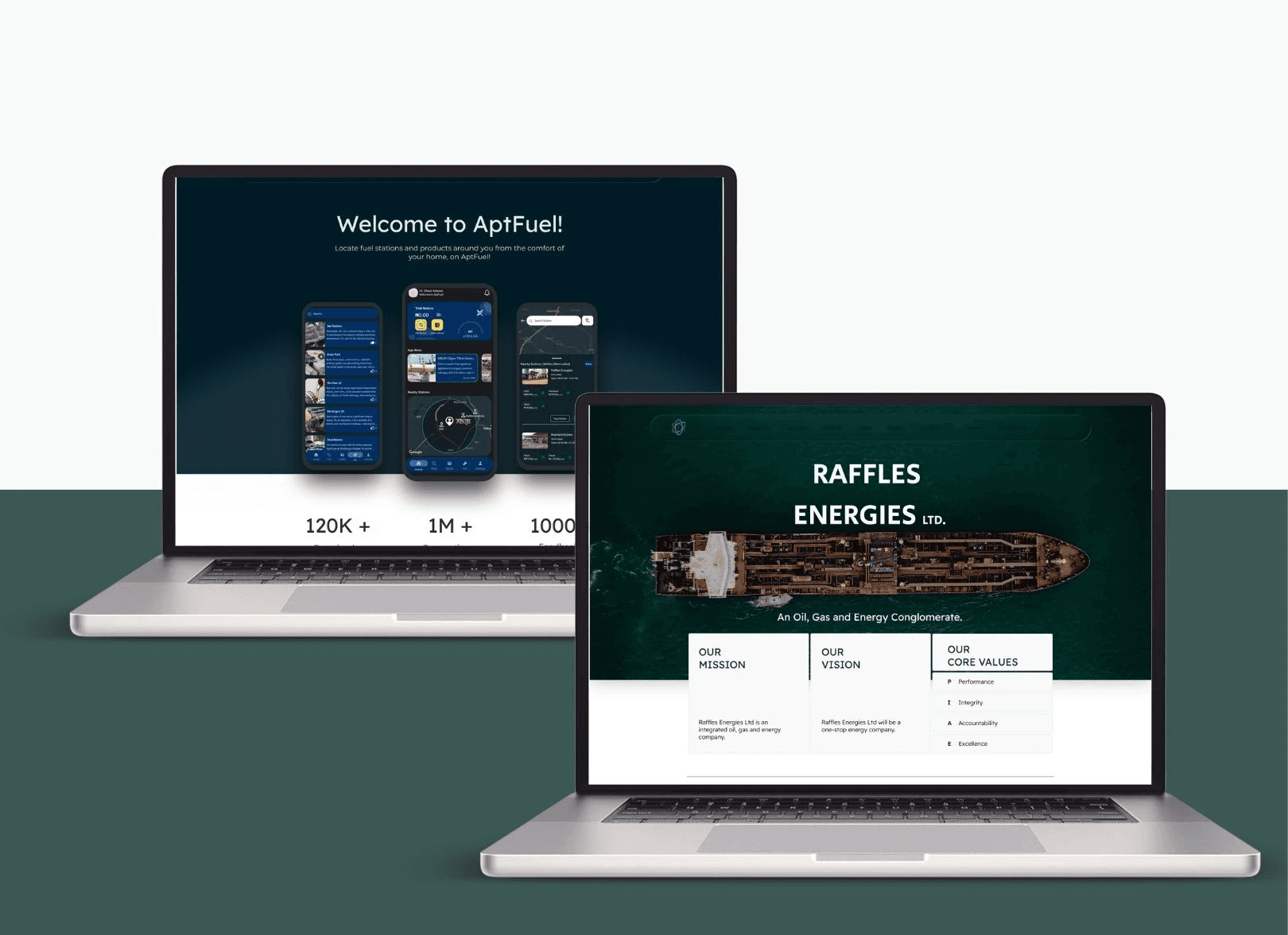
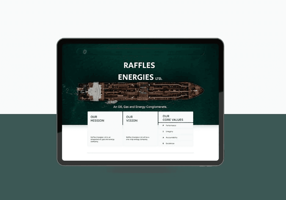
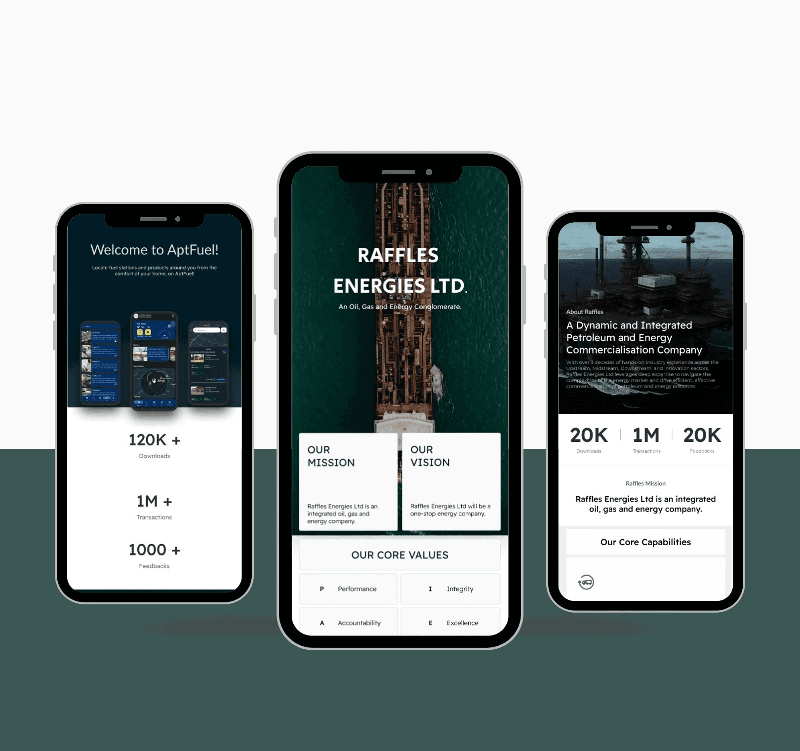
Raffles Energies Ltd – Corporate Website Redesign
Role: Lead UI/UX Designer & Web Strategist
Duration: 3 Months
Tools Used: Figma, FigJam
Platform: Web (Responsive Desktop, Tablet & Mobile)
Core Value Proposition: A modern, structured, and authoritative corporate web platform designed to simplify Raffles Energies Ltd's multi-faceted energy services, build investor trust, and drive strategic B2B partnerships.
Summary
Raffles Energies Ltd operates across multiple areas of the energy value chain. This redesign transformed an overly complex, technical service offering into a clean, professional, and accessible digital platform that accurately reflects the company's scale, expertise, and forward-thinking vision.
Problem Statement
The primary challenge was translating a broad and technical service portfolio into a clear digital experience. The previous structure made it difficult for industry professionals, investors, and partners to quickly understand what the company does, who it serves, and how its offerings differ—creating friction and reducing brand trust.
Core Goals
Simplify Complex Operations: Reorganize a wide service portfolio spanning commercialization, consultancy, gas investment, and digital solutions into scannable visual structures.
Establish Brand Authority: Deliver a modern visual identity that reinforces credibility, sustainability, and global relevance for B2B stakeholders.
Optimize Conversion & Inquiries: Streamline navigation pathways to ensure direct access to core services and partnership contact points within seconds.
The Solution
The redesign converts a dense technical portfolio into a structured 3-step visitor journey:
Immediate Value Positioning: A high-impact hero area establishing company scale, core mission, and major business pillars.
Structured Service Exploration: Clearly categorized service hubs allowing users to drill down into specific energy sectors without visual overload.
Frictionless B2B Engagement: Accessible call-to-actions (CTAs) guiding partners and prospective clients directly to consultation and inquiry forms.
User Research & Insights
Key Insights
Corporate B2B decision-makers allocate less than 20 seconds on a corporate home page to determine whether an enterprise meets their capability requirements.
Clear service categorization and transparent company leadership info are the top two factors driving trust for international energy investors and partners.
Information Architecture & User Flow
Homepage: Clear value proposition, service overview grid, key metrics, and brand positioning.
About Page: Corporate mission, sustainability vision, governance, and industry leadership experience.
Services Pages: Structured breakdowns of energy commercialization, consultancy, capacity development, gas investment, data analysis, and digital solutions.
Contact & Inquiries: Direct communication flow tailored for commercial inquiries, partnership requests, and media contacts.
Visual Design System & UI Components
The visual language balances corporate authority with modern energy innovation. It pairs a Deep Industrial Navy (#0A192F) background/surface with a Precision Emerald (#00B4D8) accent to symbolize clean energy, technology, and trust.
Design Token | Value | Visual Purpose |
Primary Accent |
| Key action buttons, active navigation states, interactive highlights |
Surface Dark/Corporate |
| Grounded background structure evoking corporate stability and authority |
Typography Header | Plus Jakarta Sans (Bold) | Crisp, modern sans-serif for high-impact corporate headers |
Typography Body | Inter (Regular) | Clean geometric legibility for dense technical reports and service copy |
Usability Testing & Design Pivots
Breakthrough 1: The "Service Overlap" Friction
User Feedback: Early testers struggled to distinguish between Gas Investment and Energy Commercialization when presented in a flat list.
The Iteration: We implemented Nested Service Hubs with Interactive Tabs, grouping related operations logically and providing brief summary cards before diving into deep technical descriptions.
Breakthrough 2: Navigation Fatigue on Mobile
User Feedback: B2B users accessing the site on mobile devices found multi-level drop-down menus cumbersome to navigate during fast reviews.
The Iteration: Designed a Streamlined Slide-Out Mega Menu featuring direct shortcuts to top-tier services and a persistent "Get in Touch" header CTA.
Impact & Business Metrics
65% Increase in Service Engagement: Visitors explored an average of 3+ service pages per session compared to 1.2 on the old site.
+40% Inquiries: Simplified contact routing generated higher-quality corporate partnership leads within the first quarter.
Sub-2-Second Load Times: Performance optimization ensured instant access across desktop, tablet, and mobile devices globally.
Conclusion & Reflections
This redesign successfully transformed Raffles Energies Ltd’s web presence into a structured, professional, and user-focused platform. By aligning the digital interface with the company’s real-world operational scale, the final design strengthens market trust and elevates the brand’s standing in the global energy sector.